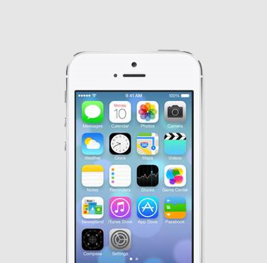
Skeuomorphism is the use of design elements to imitate features that were functionally necessary in an original product design, but which have become ornamental in the new design. There are a couple of examples below, but you’ll find many more here.

Skeuomorphic graphical user interfaces use graphical representations of physical objects to make digital interfaces look familiar and comforting. They have become popular in recent years as higher resolution, full-colour screens, and increased processing power, have provided more design freedom and as our handheld devices rapidly replace the physical objects which we have grown accustomed to. Our leather bound notebooks and organisers have been replaced by smartphones and the beautifully engineered control knobs of hi-tech instruments have been replaced by a gesture on a touch screen.
But the use of Skeuomorphs isn’t a new thing. Their use in physical product design became popular in the nineties when advances in manufacturing technology such as ‘in-mould’ labelling allowed ‘realistic’ material finishes to be applied to products in an attempt to give them a high value feel whilst using cheaper manufacturing processes. They emulated wood, leather or brushed aluminium finishes and features such as fake screw heads, stitching and rivets were added to make the products seem more authentic, more handmade and more familiar.
As we’ve become more used to modern materials and manufacturing processes we’ve seen this trend shift to a much more honest use of materials. Products made from plastic are no longer always considered ‘cheap’ and we are able to assign a high perceived value to plastic products as long as the form, colours and textures are carefully considered and the quality of manufacture is high. So are we likely to see a similar shift in the style of GUIs from a look that imitates the familiar to a more honest – digital style? And how will users react to it? Will medical products just follow in the footsteps of the consumer electronics industry or should we be looking to develop our own style?
The importance of user experience is being increasingly recognised in the medical industry and the look and feel of devices plays an important part in communicating positive emotional messages to end users. In many medical devices the GUI and physical interface often have equal status so it’s important that they adopt a coherent visual language. As with other aspects of the product offering – including packaging and instructions for use – products require a carefully considered language that communicates the core values of a brand or therapy. It’ll be interesting to see what emerges over the coming months and years – the familiarity that skeuomorphs gives users can be really useful in a medical setting where digital equipment replaces or sits alongside more physical products, but at the same time a completely new digital interface style could provide opportunities to improve the user experience.